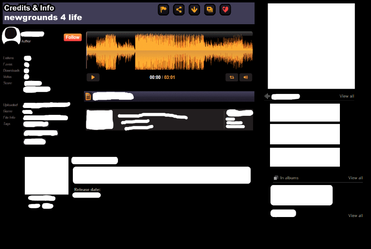
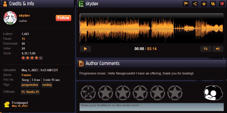
 Maybe I'm just weird but I kind of hate this part on the site, feels kind of clunky and unintuitive?
I don't understand really understand the point of restricting all cover-art to an overlay of a very small CD icon, It's already so small to the point where details are obstructed anyways!
but even when you do click on it and get a deeper look where you could in theory see a better look at the cover art (like every other music platform) you get at best something like this

sigh...
If anything why not try and make it similar to soundcloud's layout? because the layout we got right now is.. not helpful you can't really see much of anything and the clogs of text cluttering everything doesn't help much, or at the very least make the back of the site a gradient of the album art you selected?
If you refer to the image at the top you can see with a better layout it's so much better (minus my editing skills, because someone with any bit of design skill could do 10x better) but with a layout like that, you could simplify some stuff and add some other stuff! not to mention give album art an actual purpose lol
VicariousE
I do like album art... maybe @tomfulp could address the thinking/data penny-pinching?
For me, I don't care for the limited space for descriptive text in titles, large thumbnail views (none at all), blogs. Meh, chalk it up to meat-bag migration to big data?
But if I know Tom, he wants a unique, from-the-devs experience.... cellphone/android/apple view? I can't let this old site onto mobile pocket-pc's :p
bluepenguins
Just sucks since my eyes are going out, so what I do see of most people's art is just a pixelated blurry mess in the audio tab sadly